Overview
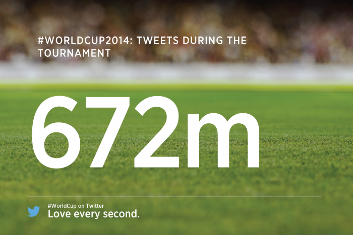
FIFA’s World Cup App is a companion app for the tournament which took place in 2014 in Brazil. By the mid-point of the games, “more than 2.5 billion screen views had been consumed, with fans spending an average of 54 minutes each interacting with live, editorial and social content. By the final whistle, the app had become the most downloaded sports event application of all time with over 28 million downloads, #1 in over 200 countries”and the 2014 tournament being acknowledged as the ‘first truly mobile and social World Cup’.”
Background & Role
In early 2013, I was invited to work on the official app for FIFA alongside Grapple Mobile’s team of fantastic designers, developers, and product managers. As a member of a small cross-functional team, I was responsible for the high-level concept, conducting a deep-dive discovery process, as well as delivery of the main experience of the app for mobile & tablet on iOS and Android.
Project Goals
Together with FIFA we identified three main goals for the app:
- Users should be engaged with the app despite games themselves being unavailable in the app. The engagement should happen before, during and after the games.
- Both everyday football fans and people tuning in just for the event should feel that the app is valuable and enjoyable.
- Thanks to the app users should have a perception of FIFA as a socially responsible and inclusive brand, highlighting organisation's social and charitable work around the world.
Discovery & Process
The team collaborated intensely for a week trying to break down the requirements into a meaningful user experience and high-level concept. The sessions were organised in way which encouraged collaboration and creative input from all members of the team—including managers and developers. This allowed every department to feel involved and excited about the project, fostering a greater team spirit—which is what often drives the concept through to delivery.
At the end of the creative discovery, we solidified three themes we wanted to guide this project. All this was to have a point of reference later on in delivery that we could look back to to assess priority of features and ideas. These were: Global Stadium, Game On, Responsible Brand.
Global
Stadium
The world's biggest conversation
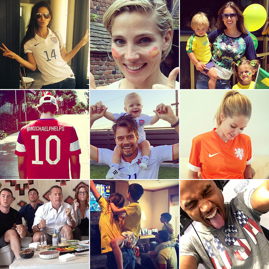
One of the main concerns of our creative session was the how to drive engagement with the app without live steaming available on the platform. We asked ourselves what else made the tournament exciting and how we could make the app useful for people watching the games at home. Our research suggested that fans loved the conversation happening around the games almost as much as the game itself—with vast majority posting passionately on Twitter, Facebook and Instagram about their preferred teams. We expected this behaviour to intensify as the Cup enveloped—from both people watching games at home and those experiencing matches at stadiums.
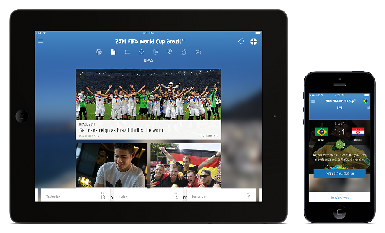
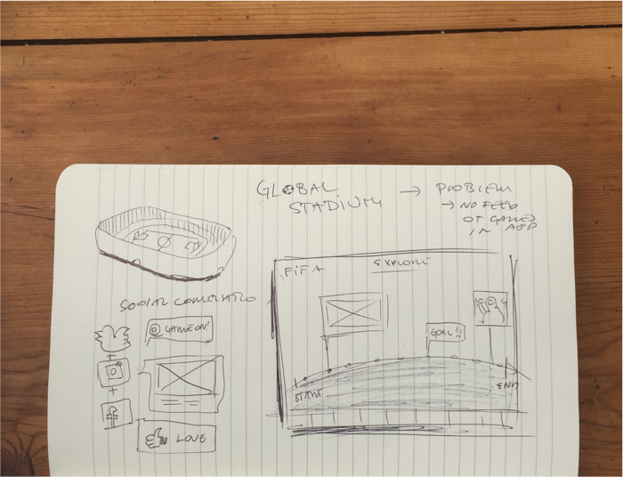
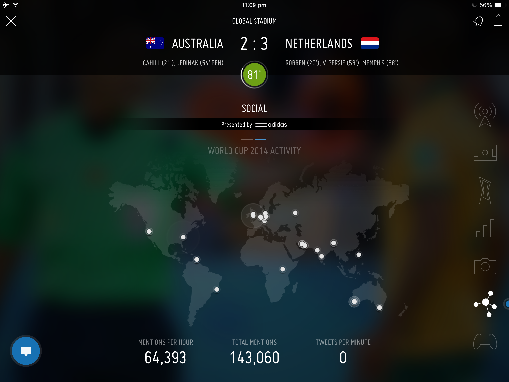
The stadium
The realisation of vast content generated by users during the games, sparked the idea of a Global Stadium—a space in the app where the social content from around the world can be experienced by all users, with smart algorithms highlighting the most relevant content to each fan. The app would prioritise content by user’s preference, favourite teams and country of origin, putting focus on the content arriving from the actual stadiums and exclusive behind-the-stage official footage to allow people watching at home feel as close as possible to actually being there.

Live draw
The majority of users would interact with the app during the Live Draw, which coincided with app’s initial launch. We wanted to ensure that the app's value as second screen was clear for this occasion. We put effort in making the Live Draw experience in the app replicate the physical draw and help users understand the impact of each result as those came in.

Rewind
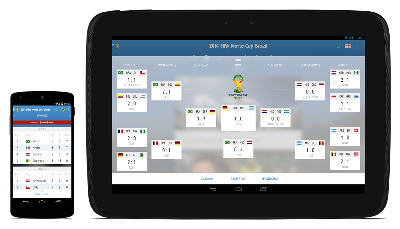
The rewind functionality was crucial not only for fans ability to relieve an a given match, but also for the app’s graceful degradation, after the World Cup was over. We made sure the app would remain current, by providing information about the next relevant tournaments and the next World Cup. The 2014 World Cup was to become archived alongside other World Cups of the past, allowing fans to relieve the moments of glory.

Game
On
Dynamic Feel
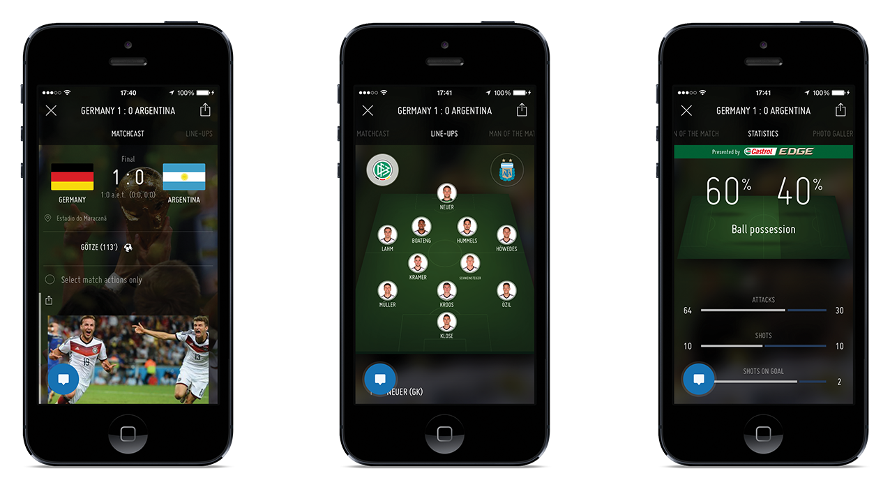
Another theme supporting the app's concept was recreating a dynamic feel and rich interactions of football games such as FIFA by EA Sports as well as sports TV channels to make the consumption of large amount of information feel fun and entertaining. We looked particularly towards various American sports channels featuring dramatic animations and airy ambiance.
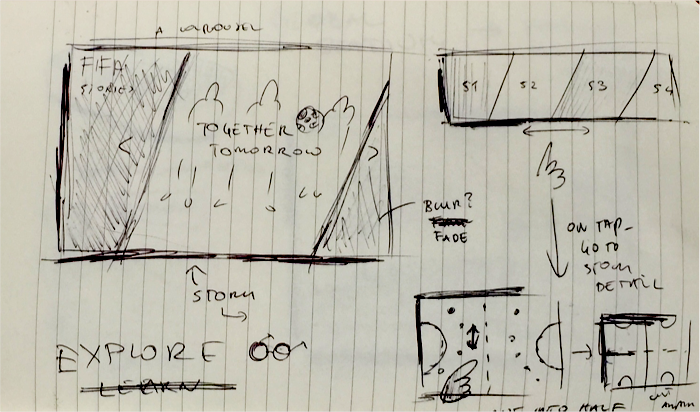
We paid attention to transitions, contextual UI, and used fake blur effect (mind you this was before iOS7) to create a sense of depth and context. Diagonal lines running through the design were a mindful continuation of FIFA’s logo and a reminder of the dynamic nature of sports. We considered modeling core navigation after elements familiar from football pitch. We also built a prototype of a hidden game that users could activate with magic gesture (only to discard it later).


Made with care
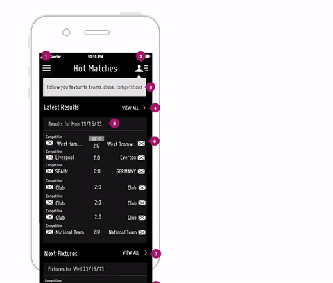
We carefully crafted Information Architecture of the official football stats and match updates to design a clean news reader and football database where fans could easily find and understand the information they encounter. We also ensured it was easy to follow your favourite teams and subscribe to match reminders. E-Consultancy commented: “This is a pretty impressive bit of UX...All nice and slick and a delight to use.”
Responsible
Brand
Play to learn
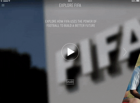
Finally, we asked ourselves how can we introduce people who come to the app for entertainment to an educational piece about FIFA’s charity work. We needed to craft the perception of the brand as socially responsible and inclusive of everyone. Looking at top children’s educational apps, we figured that the best way to teach a distracted mind is through a compelling interactive storytelling. We aimed to achieve that by building an Explore section with a series of stories containing simple tasks that unlock consecutive pieces of information.
Inclusive of all audiences
Another way of making everyone feel one with the global brand was through a design that worked across platforms and in all the supported languages without a compromise to the experience. This meant making sure that no user felt second-best because they have an older device or poor internet connection. Additionally we optimised the app for accessibility and vision impairment.
Launch &
Reception
Launch & Reception
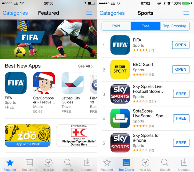
At the time the app launched and World Cup officially kicked off, I was celebrating my 30th birthday in Iceland. Watching the Live Draw with the FIFA companion app on my lap, I fondly revisited the excitement of my first day on this project. I was now ecstatic to see that the app was finally available for everyone to download. Soon after the app reach number 1 in 200 countries, generated over 2 billion screen views and 28 million downloads generating favourable reception from the fans and design community.

In 2014 the app won a Football Business Award for Most Innovative Use of Technology: “The success of the Global Stadium during the 2014 FIFA World Cup Brazil forever changed the way in which worldwide sporting events are digitally consumed. Billions of fans also enjoyed the World Cup from the comfort of their own homes, at work, on the move. Truly groundbreaking.“
In 2015 the app was a runner up for a WEBBY Award for Best Mobile Sites & Apps.
E-Consultancy: “The UX is basically flawless, and information is presented elegantly and simply. The imagery, the formatting, the type, the transitions, the icons; it’s all pretty...It compares very favourably with (is better than) other ‘match centre’ apps such as Sky Sports, but offers lots of other content, too, notably news, World Cup content, FIFA rankings and interactive games.“
Afterword—3 years on
It’s now 3 years since we were commissioned to work on this project. While I still feel this is one of best projects I’ve worked on to date, I can’t help but scrutinise some of the decisions we made. In particular—given a chance—I would refine the use of iconography and redesign the main navigation to help drive traffic to all the sections of the app. I would also give more attention to the notifications strategy which I feel are becoming a platform in their own right.
Looking forward to the next version of the app for the 2018 World Cup in Russia! 👟⚽️