Overview
Burberry Mobile is a state-of-the-art mobile web app providing elevated luxury shopping experience to millions of visitors from 50 countries around the world. Since launching in late 2014, the mobile site has been the fastest growing platform for the heritage brand, tripling yearly conversion rates and revenue. Today the app continues to overperform business goals as well as exceeds customer and industry expectations—helping cement Burberry‘s position as digital leader in luxury space, as recognised by the L2 Digital IQ Index. The site was also praised by the ForeSee Experience Index 2015 who say: “Burberry is brilliant in mobile. Every retailer should be checking out the app right away and emulate what they can in 2016.”


Background & Role
In 2014 I was invited to help craft Burberry’s new mobile site thanks to on my previous experience with native apps and online commerce. My role at Burberry was to help crystalise the vision for the app, lead the delivery of the initial stage of the project, and then lead the ongoing improvements to the platform, ensuring the global customer needs are addressed and the experience provided is continuously improved. My overarching task is to translate user needs and brand requirements into a meaningful, convenient and carefully crafted luxurious shopping experience for mobile browsers used by our global audience.
Objectives
The three main business and customer goals for Burberry mobile were:
- Allow customers to explore and interact with Burberry’s rich brand content and help invoke luxurious feel in a mobile browser.
- Provide users with a highly usable shopping experience on mobile driving conversion up year on year. Focus on quality and range of product.
- Make it easy to reach out for help and ensure the customer is aware of the wide range of services offered by Burberry.
Kick-off
The team collaborated intensely for a week trying to break down the requirements into a meaningful user experience and high-level concept. The sessions were organised in way which encouraged collaboration and creative input from all members of the team—including managers and developers. This allowed every department to feel involved and excited about the project, fostering a greater team spirit—which is what often drives the concept through to delivery.
We kicked off the process with a series of workshops that addressed questions we needed answered before jumping into the design. Who is the mobile luxury customer? What are their core needs? How do they interact with Burberry currently?
Modern
Luxury
Customer
Who is our customer
To better understand what kind of product we needed to ship we focused on better understanding our current customers needs. We collaborated with our Insights Team that helped analyse the behaviours of Burberry’s current mobile users and the global industry trends for comparison. Having consumed this data we decided extend the traditional Burberry user classification by spend to include shopping patterns and qualitative data about their needs and fears. We also investigated general perception of luxury — focusing on who they where and what luxury meant for each type of customer. After conducting interviews and anlysing global patterns we found that our mobile audience is more young, slightingly more female, app savvy, valuing quality product, brand experiences, time-saving interactions and with a growing tendency to convert on mobile. These insights were translated into user profiles that we would look back to during design and help in discussions with different stakeholders.
Secondly we looked towards Business and Creative requirements to understand how to merry user's needs with Burberry's brand direction. The team agreed to group the findings of our discovery in three themes that would guide us through the delivery of this project. There were: Immersive Brand, Seamless Commerce, Effortless Service
Immersive
Brand
World of Burberry
The first theme that guided our project was the brand belief that our customer should be able to experience the richness of familiar from our physical stores on their mobile phones. We wanted the mobile experience immerse our visitors in the incredibly inspiring world of Burberry and feel inspired by it. We felt Burberry’s creative content needed space to shine and make sure that we turn the limitations of the small screen into our advantage. Our motto was to “let the images do the talking” and strived for an intuitive invisible, paired back UI that was familiar yet allowing for the brand and product to take center stage (this has proven to be particularly difficult and was a place where we it took a couple of tries to find a solution that truly worked).
Flexible and Smart
Another challenge was to ensure that the rich templates we proposed were responsive and easy to manage by Burberry’s digital merchandising team who need full control over the content published around the world and to easily tailor the experience appropriately from country to country. This was done by designing a flexible grid system that preserved the hierarchy of information well between mobile & tablet, and allowed for easy regional customisation. We worked collaboratively with the merchandising team to ensure we provide them with the right tools for the job.


Burberry Feel
Finally we needed to ensure the app conveyed a feeling luxury that one gets when entering a Burberry store. How do you convey a feeling of luxury in mobile design, we pondered. It became clear this could be attained only if our mobile web experience was as smooth as that of a native app. Together with our development team we paid a lot of attention (and a couple of prototypes) to transitional animations and loading patterns that would make the mobile website feel distinguished, elegant, quick and app–like. We took advantage of advanced coding skill–set we had in the team and prototyped the core structure of the app to help convince stakeholders to our vision and to allow for immediate testing sessions with customers. We also focused our design language to ensure brand content is sharp but loads fast, legibility is preserved, icons are clear and coherent with the brand, and UI treatment feels familiar yet intrinsically Burberry.


Seamless
Commerce
Quick & Convenient
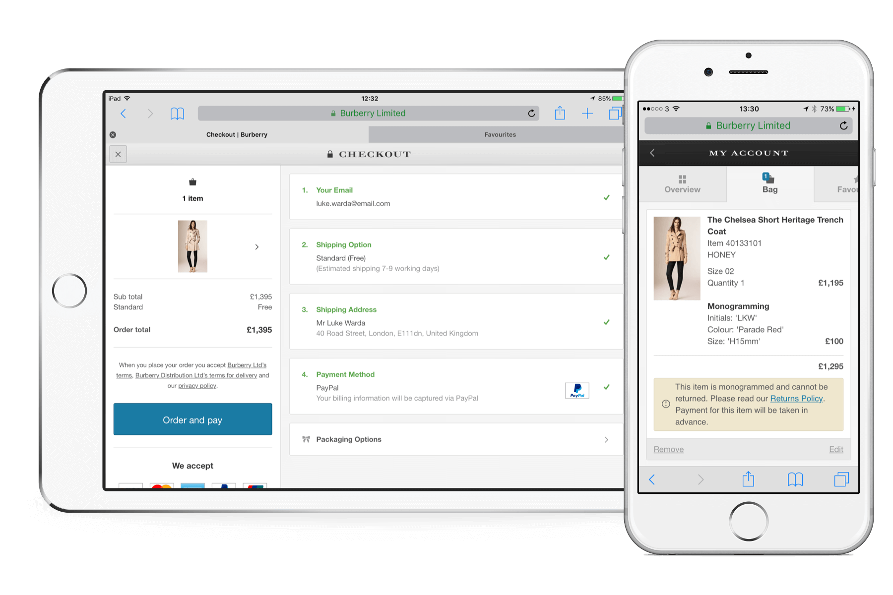
The second principle that guided our delivery was that of the commerce for mobile customers should be the most seamless of all our platform as it is the least trusted platform for big transactions. We wanted to make sure that the whist the brand content is King, the shopping experience takes the learning of industry's best standards and years of insights from our Desktop store, offering shopping which is simple, quick and intuitive. After much consideration (and numerous tests) we came up with a navigation that sped up user’s journey down to the Product Details Page, surpassing some of the pages that they would encounter on Desktop to reach the same destination.


Comfortable Browsing
Mobile Product Listing Pages were designed in a way that allowed customers have a quick overview of the entire page as well as detailed look that allowed for better comparison and sorting. We also ensured filtering, which is a conversion driver, was easy to find and use. Finally we ensured that going backwards and forwards was easy leveraging familiar native browser back button. In fact this was the loop of PLP to PDP has become more successful then on Desktop.


Focus on Quality, Storytelling & Personalisation
An area of focus was Product Details Page, whose job is to not only describe the product but to seduce with rich stories and allow to either save or shop the item effortlessly. The page leads with a large high-quality image gallery, allowing for an intuitive pinch-to-zoom to have a close look at the detail of craftsmanship that going into every Burberry garment. We tested multiple shots variants to optimise the viewing experience between product categories and audiences (we found that leading with flat shots works better for Menswear in certain categories). Then follows a detailed description and dynamic delivery options that we have AB Tested for placement and importance in the shopping funnel. Another big piece was the ability to customise the product on page without having to go away anywhere. This has proven particularly important during a big Monogramming & Personalisation campaign that launched in 2015 and continues to be evolved. Equally important was for us to be able to include storytelling component on Product Pages, since we observed a positive trend for this both in-store and during our off-site digital experiences.


Buying Easy as 1–2–3
One of the hard requirement for the mobile project was to ensure the conversion for both Add to Bag and Checkout are improved. To make our customers felt secure and confident shopping high-price items on mobile we invested a lot of time to learning about their current shopping patterns and pain-points. We found that once decided on a product, the customer likes to come back several times to the site before making the final purchase. Even when in checkout and having filled in partial information they would come back several time before committing to purchase. We decided it was important to optimise these journeys by making it easy to go back to where you left off if you’re a returning customer. Just like a native app, our mobbile site would remember your shopping and checkout choices even if you are not logged in. Instead we would encourage you to sign up after you’ve made your first purchase — all your details were already with us, all we needed for your consent. For registered and logged-in customers we pushed the experience towards one tap payment in checkout, with a clear option to overview all the transactional details before hitting “Pay.”


Effortless
Service
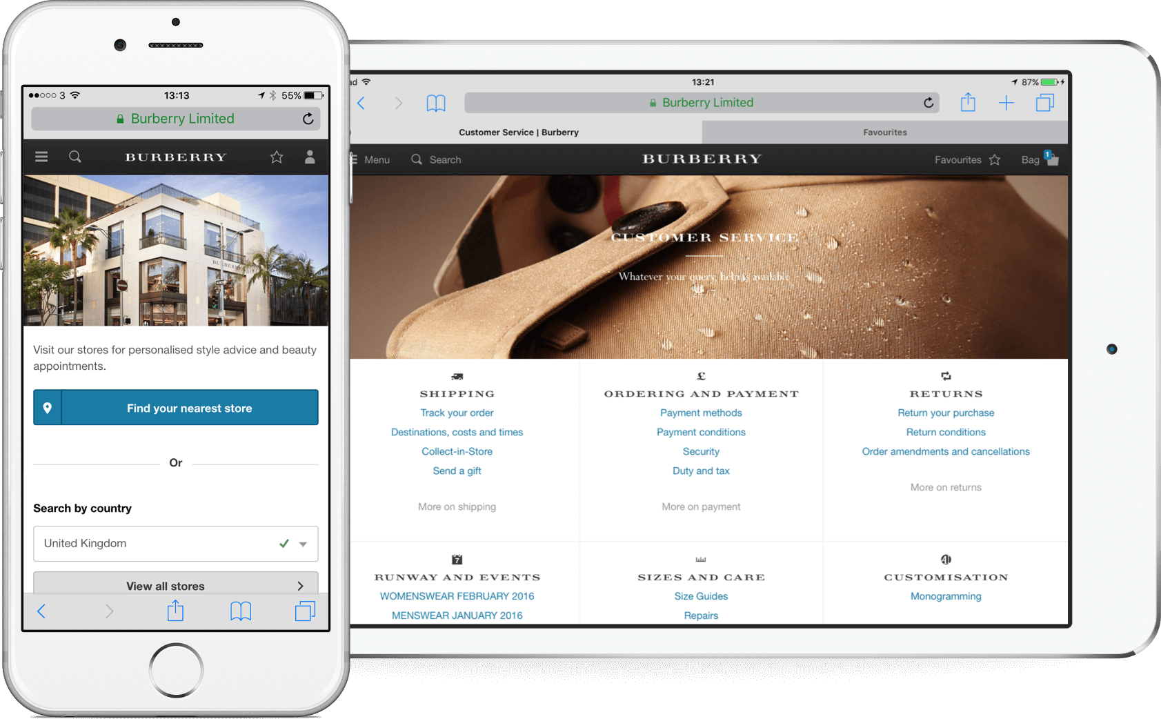
Need Help?
Final, yet central to the preposition of mobile Burberry was the idea that we should make it possible for our customers on the go to experience the service we offer in store. We wanted to make sure that the users realises that they can get assistance or style advice at any point of their journey on mobile Burberry.com. For that reason we have included a convenient access point to assistance — in the footer of the site and in the main navigation, allowing customers to either call or message our customer services team with questions about sizes, returns, or style. More so, we have completely re-architected the information architecture of the Customer Services area, making it easy to self-serve and find helpful information about orders, returns and seasonal offers.


Launch &
Beyond
Towards MVP — Reshaping our Process
The six months before the launch of the new mobile site in 2015 were the most intense of the whole project. Racing agains pre-peak deadline meant we had to prioritise and figure out which parts of the experience could be delayed without compromising the core preposition. We decided that in order to deliver an overall satisfactory product on time we will have to re-design our design and delivery model to facilitate quicker validation of assumptions by means of prototyping, usability tests and collocation.

The traditional staggered delivery approach, where UX hands over to Design, who handover for Sign-off only to be picked up by Development, was too time consuming, not allowing us to take independent decisions where necessary. I was in favour of a different model where everyone is a product designer, has an area to take responsibility over, and acting as an advisor to others in their area of expertise. Another important change was sitting down amongst developers to limit the amount of overhead documentation and frustrations that come from misunderstanding bloated specs and requirements. I was also particularly passionate about the role of prototyping in design, running workshops for anyone from any department who wanted to learn how to prototype using a variety of tools from keynote all the way to javascript. Additionally we negotiated a fund for a modern designer toolkit, which allowed our designers to try out new software in their work more frequently.


Launch & Feedback
The new process allowed us to deliver the project on time and budget — right before the ever crucial pre–Christmas peek. Thanks to fantastic dev organisation and strategy the roll out went soothly without major hiccups. Week after week new stats where coming in confirming that the project was in fact the most successful launch for the brand in 2015. Mobile website overtook Desktop in terms of traffic in early 2015. Within 12 month mobile has tripled in terms of digital growth and conversion rate improved +70%, exceeding benchmarks for peer Luxury retailers.

Next year Burberry was listed as no.1 on L2 Inc. Digital IQ Index due to amongst innovation in social media, due to the success of the investment in mobile luxury. In 2015, ForeSee Experience Index hailed Burberry’s mobile site the best in class, coming out top in luxury and second only to Amazon in overall. Eric Feinberg says “Burberry is brilliant in mobile. Scoring an 83 (only Amazon scores higher), Burberry has perhaps themost beautiful mobile retail site we’ve seen (though look-and-feel is only one element of a multifaceted mobile customer experience). Burberry’s immersive experience is thoughtful, simple to use and inclusive of a carousel of pristine visual images with simple pinch-and-zoom full-screen viewing, a brief easy-to-read garment description, favorites list, sizing guide, social sharing, easy product filtering, a recommendation engine and access to feedback and customer service. All of those features are on a single product detail page. One survey respondent said, “I like how easy to navigate it is. I like that you don’t have to click several pages to get to what you want.” Every retailer should be checking out Burberry’s app right away and emulate what they can in 2016.”


Post MVP
The success of the mobile site for Burberry had an impact on funding for the platform allowing us to drive the product further. Together with business team we worked out a roadmap for the upcoming year rolling out incremental improvements throughout 2015 and 2016 including new payment methods, store stock lookup and optimisation in Product Pages, Search, Phase Two of Filtering and Faceting and Checkout, having positive incremental revenue , often in the ballpark of +£1m. The success of these has paved way for paving way for new mobile projects and design overhaul of Burberry.com on Desktop in 2016.
Impact on organisation
Otherwise the mobile project had big impact on the Burberry as an organisation. The mobile model of delivery was replicated across the whole Creative Media & IT departments, with multiple independent streams being responsible for given parts of digital Burberry experience.
Afterword—Reflections
It is now three years since I have joined Burberry to lead mobile and touch initiatives. The 2.5 years dedicated to Mobile project were the most challenging and most rewarding time of my professional career, allowing me to grow as a designer and collaborator. One of the biggest lessons learned in this project was how to push a product forward in a big organisation and ensure customer-centric perspective is represented by all stakeholders. Another skill that I acquired during this delivery was a better understanding how to balance requirements of a global luxury brand and user needs. Looking back at the project with a critical eye, if given chance, I would be like to revisit main navigation, purpose of the homepage and first time checkout experience for a better conversion and easier of progression.